

Agri-tech · UX research · Concept project

A day-by-day farming guide for India’s smallholder farmers

A self-initiated concept: a mobile guide that tells a farmer what to do today, from planning and pests to prices and schemes. Prototype tested with 15 farmers, and now being rebuilt.

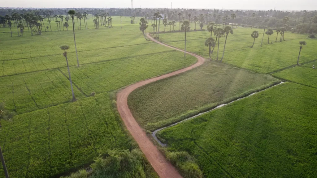
Aerial view of a winding dirt road through green paddy fields and palm trees
Role
Sole product designer
Timeline
2.5 weeks
Platform
Native Android, budget smartphones
Status
Published

At a glance

The problem

Farmers keep about a third of the retail price, and pests and disease take an estimated 20-30% of yield. The people who most need guidance are the hardest to reach: only 29% of rural Indians were online.

What I designed

A mobile guide that tells a farmer what to do today, from planning and pests to prices and schemes, built for low literacy, weak signal and local languages.

The evidence behind it

Eleven products reviewed, three proto-personas, and a prototype tested with 15 farmers across Karnataka.

My role

Sole product designer: research, strategy, UX, UI, design system, prototype and testing.

Three decisions that shaped it

  1. 01Lead with what to do today, not a dashboard
  2. 02Plan for voice, pictures and offline from the start
  3. 03Launch with five features and hold pest detection until it can be trusted

How I know it works

Weekly farmers completing their tasks

01

The brief

A self-initiated concept: a farming guide that tells a farmer what to do today, designed for people with a basic Android phone, patchy signal and little time to learn an app.

What it is
A concept project for my portfolio, not a shipped product.
My role
Sole product designer: research, strategy, UX, UI, design system, prototype and testing.
Early prototype
Built in 2.5 weeks and tested with 15 farmers across Karnataka.
Final design
In progress: the same product, with the UX and UI reworked from scratch.

02

Where a farmer loses value

Secondary research showed where farmers lose value, and how hard the people who need guidance most are to reach.

33%

of the retail price reaches the farmer

For fruits and vegetables. The rest goes to middlemen, transport and retail.

Source: Economic Times ↗

20-30%

of yield lost to pests and disease

Warnings and advice arrive too late, or not at all.

Source: ICAR 2021, via Samunnati ↗

29%

of rural Indians were online

Phones are common, but connectivity and digital skills are not.

Source: IAMAI 2023, via Samunnati ↗

  • About three in four rural households surveyed by ASER had a smartphone in 2022, up from 36% in 2018
  • Over 80% of the agricultural workforce is small and marginal farmers
  • Language was the biggest barrier in my testing

03

What already exists

I reviewed eleven products and platforms in the space. They are strong in places, but they mostly start somewhere other than the farmer’s day.

Each dot is a product. Left to right shows how much of the crop cycle the product helps with. Bottom to top shows who it is built for. The green corner is the space nobody covers.

businessesnew farmers

Helps farmers, but only after the harvest

Helps new farmers through the whole season

After the harvest, built for businesses

The whole season, built for businesses

Cropin
Farmonaut
StarAgri
eNAM
AgroStar
DeHaat
Krishify
RML
e-Choupal
IFFCO Kisan
Katyayani
FarmCircle
← after harvest onlywhole season →
  • An existing option
  • This product
Placement comes from my review of eleven products: their published features, who they are built for and how they work, set against the same two questions.

Advice and crop health

  • Farmonaut
  • Cropin
  • IFFCO Kisan
  • RML

Satellite insights, enterprise analytics and advisory. Some are built for agri-businesses, some are text or SMS only.

Inputs and commerce

  • DeHaat
  • AgroStar
  • Katyayani Krishi Direct

Strong on delivering seeds and inputs. The advice is usually tied to a sale.

Community

  • Krishify

Peer advice and vernacular Q&A. Useful, but not structured around a crop cycle.

Markets and finance

  • eNAM
  • e-Choupal
  • StarAgri

Transparent prices, kiosks, warehousing and finance. Little help before the harvest.

The gap I saw

  • Few help a first-time or semi-literate farmer, with visual or voice support.
  • Most do not help with planning before sowing or with tracking in the season.
  • Government platforms have excellent data but little that a farmer can act on.

04

How I worked

From the numbers to a tested prototype in four steps, each one building on the last.

  1. 01

    Secondary research

    Industry reports, government data and academic studies, to find where farmers lose value.

  2. 02

    Competitor review

    Eleven products across advice, inputs, community, markets and finance.

  3. 03

    Hypotheses

    Three proto-personas, each with a problem, goal and hypothesis to test.

  4. 04

    Early prototype and test

    A clickable prototype, tested in person with 15 farmers across Karnataka.

05

Three people I designed for

These are proto-personas, built from research before I met a single tester. They span the range of access and confidence, and testing was how I checked them.

R

Ramesh, 45

The experienced optimizer

About five acres and twenty years of farming. Uses WhatsApp and YouTube. He knows the land, but weather and prices are less predictable than they used to be.

Hypothesis. If Ramesh gets timely, specific advice and sale guidance, he will rely on the app to decide on his yield and his price.

K

Kavita, 30

The new farmer

Two to three acres, inherited. Educated and keen, but overwhelmed by choices: which crop, which input, what to do next.

Hypothesis. If Kavita can compare crops and follow guided steps, she will gain the confidence to complete her first season.

S

Sujatha, 60

The traditional smallholder

One acre, farmed with her husband. Cannot read English and avoids apps for fear of pressing the wrong button. Wants to be told, shown and reassured.

Hypothesis. If Sujatha can see and hear the guidance in her own language, she will use the app on her own.

06

What the early prototype taught me

I tested my first clickable prototype with 15 farmers. It was the most useful part of the project: five findings, and a clear list of what had to change.

  • 15 farmers across Karnataka
  • Mixed literacy and experience
  • Clickable Figma prototype, in English, on Android
  • In person, with a hotspot for poor signal
  • Moderated tasks, voice notes and a verbal survey

What I heard

Usable, but language was a barrier

“I can’t read English, but I can follow if someone tells me.”

What it meant

The interface needs voice and pictures, not just better words.

What I changed

Voice narration and picture-led tasks added to the design plan.
What I heard

Too much text confused new farmers

“There are so many options… which is best?”

What it meant

Too many choices up front stalls a first-time user.

What I changed

Crop planning cut to three steps, with comparison cards and filters.

What I heard

Farmers wanted it to work offline

“Network is poor in our field. The app should work offline.”

What it meant

Connectivity is a design constraint, not an edge case.

What I changed

Offline-first plan: cache tasks and the weather forecast.

What I heard

The assistant was barely used

What it meant

People did not know what to ask an open-ended bot.

What I changed

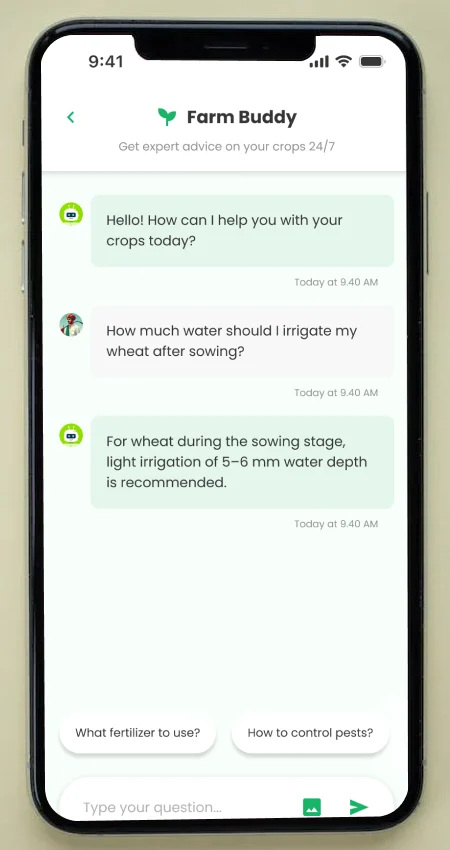
Make FarmBuddy proactive: suggested questions, and awareness of the screen the farmer is on.

What I heard

Selling prices were confusing

“Is ₹2,000 a good price or not?”

What it meant

A number means nothing without something to compare it with.

What I changed

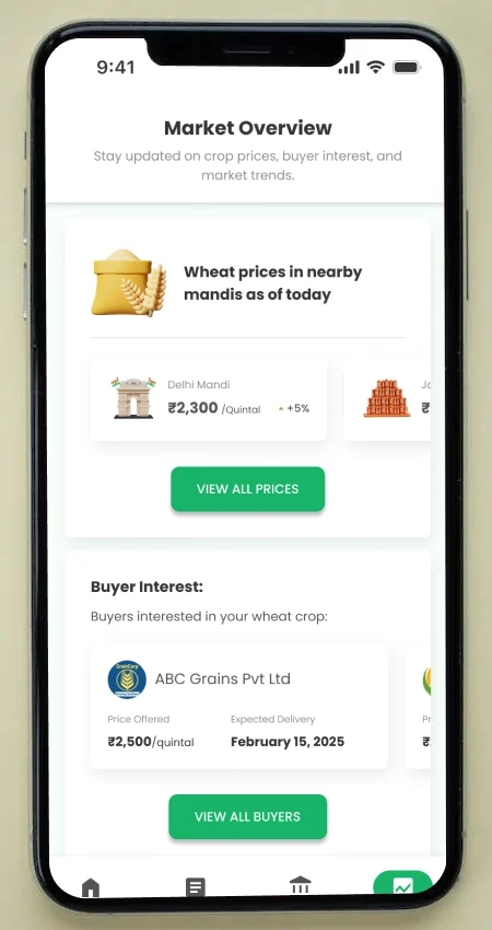
Added mandi benchmarks, a price forecast and sale tips.

07

What I measured

Counts from 15 moderated sessions. I use counts, not percentages, because that is what a sample this size supports.

12 / 15

followed the stage-wise tasks unaided

The other three needed small prompts, mostly because smartphones were new to them.

13 / 15

felt more confident choosing a crop

After using crop planning, 87% said they felt more confident about what to plant next.

10 / 15

said the price forecast gave them more control

Over when and where to sell.

13 / 15

would use it weekly, if it had voice support

The condition matters: every one asked for support in their own language.

“I can’t read English, but I can follow if someone tells me.”
Tester, semi-literate farmer, Karnataka
“There are so many options… which is best?”
Tester, first-time farmer, Karnataka

Where validation goes next

  • Round one was a moderated prototype test with 15 farmers across Karnataka. Round two widens it to more states and languages.
  • The tested prototype was in English. The final design adds voice and Kannada, and those are the first things I test.
  • The results above come from the early prototype. The final design runs through the same tasks again, so the two can be compared directly.
  • Round one measured understanding and confidence. The next round follows farmers through a full season: repeat use, then yield and income.

09

Design principles

Five rules that came out of the testing and the research. Each one is something I would hold the final design to.

  1. 01

    Tell me what to do today

    The strongest reaction in testing was to “what should I do today?”. Lead with the next action, not a dashboard.

  2. 02

    Show less first

    Too many options stalled new farmers. Offer a few good choices, with a way to see more.

  3. 03

    Pictures and sound before words

    Language was the biggest barrier. Use icons and, where possible, voice, so reading is optional.

  4. 04

    Work without a signal

    Connectivity in the field is poor. The tasks and the forecast must work offline, and say how fresh they are.

  5. 05

    Give every number something to compare

    A price alone meant nothing (“Is ₹2,000 a good price or not?”). Show the benchmark, the range and the trend.

10

The calls I made

Five decisions shaped the product. Each one answers something the research or the testing showed.

01

Lead with what to do today

Options I weighed

  • A dashboard of data
  • A library of farming knowledge
  • ✓A daily task view

Why

The strongest reaction in testing was to “what should I do today?”. 12 of 15 testers followed the stage-wise tasks on their own. Clarity of action beats volume of information.

02

Plan for voice and pictures from the start

Options I weighed

  • English first, translate later
  • Text with icons
  • ✓Voice and picture-led screens

Why

Language was the biggest barrier. “I can’t read English, but I can follow if someone tells me.” 13 of 15 would use it weekly if it had voice support.

03

Work offline

Options I weighed

  • Online only
  • ✓Cache the task list and the forecast

Why

Signal in the field is poor. “Network is poor in our field. The app should work offline.”

04

Fewer choices when planning a crop

Options I weighed

  • Show every option
  • Let the AI choose one crop
  • ✓Three steps with comparison cards

Why

New farmers stalled on too many options: “which is best?”. A short comparison keeps the decision with the farmer.

05

Launch with five features, not nine

Options I weighed

  • Ship everything
  • ✓Ship the core five and hold three

Why

Pest detection, direct buyers and the scheme explorer each carry risk: a wrong diagnosis can cost a crop, and buyers need trust. They follow once the basics are trusted.

11

What the product does

Nine features, grouped by the job a farmer is doing. They all sit behind one idea: tell me what to do today. The scope stays the same in the final design, and the experience around it is rebuilt.

Plan

  • Daily snapshot

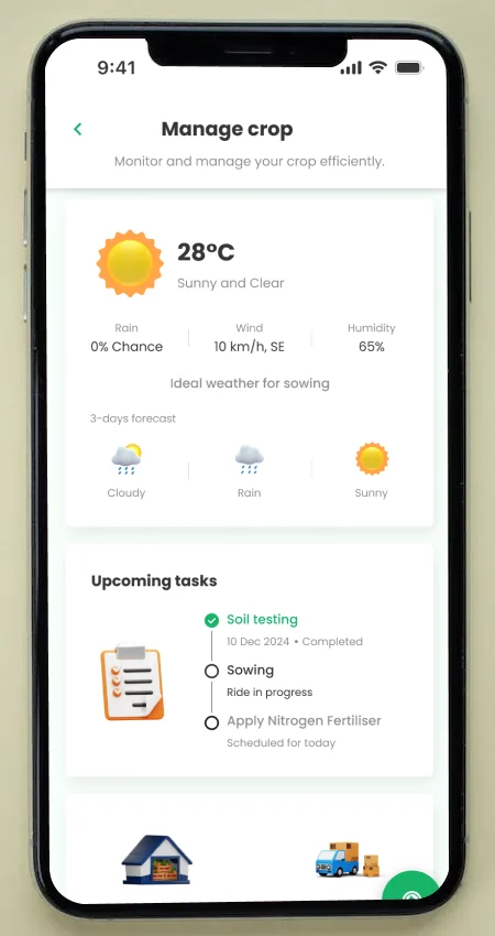
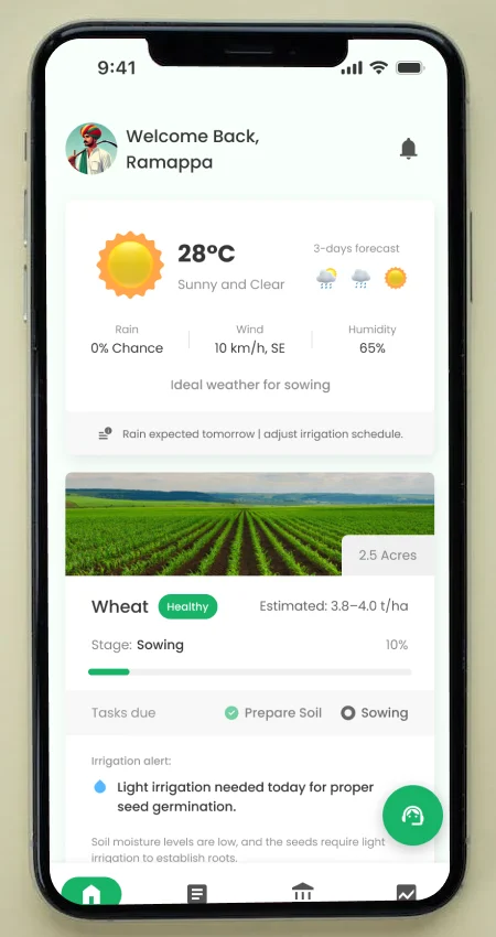
    Weather, active crops, task alerts and market rates on one screen, so “what should I focus on today?” is always answered.

  • AI crop planning

    Suggests crops from land data, water availability and the forecast, to reduce trial and error from the first season.

Grow

  • Task-based crop management

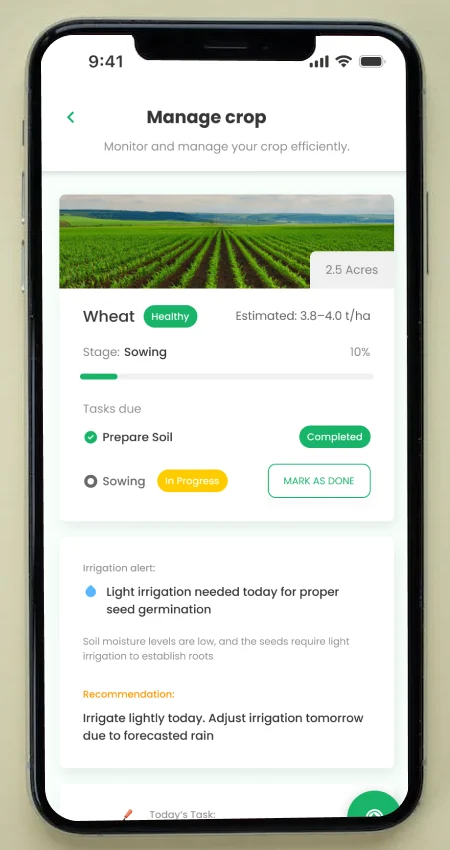
    Stage-wise checklists for watering, fertilising and crop care, with reminders.

  • Weather alerts and irrigation tips

    Weather turned into a decision: when to water, when to protect.

  • Pest and disease detection

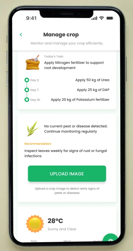
    Upload a photo of a crop and get a likely diagnosis and next step.

Ask

  • FarmBuddy, the assistant

    Part of the app from the start: a chat assistant for questions in natural language, so farmers can ask instead of searching through menus.

Sell and fund

  • Price forecasting

    Current mandi prices beside trends, to choose when and where to sell.

  • Direct buyer access

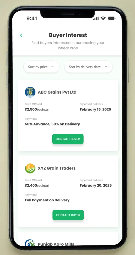
    Buyer interest, chat-based negotiation and sale planning.

  • Scheme and loan explorer

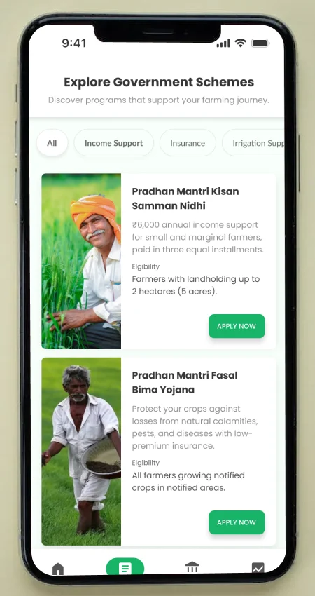
    Checks eligibility for government schemes and the Kisan Credit Card.

12

What goes in the first release

Nine features is too many for a first version. This is my prioritisation, based on what the testing showed and on what is risky to build.

  1. 01

    Daily snapshot and tasks

    The core. 12 of 15 testers followed the stage-wise tasks on their own, and the daily view is what drew the strongest reactions.

  2. 02

    Crop planning, simplified

    Cut to three steps. 13 of 15 said it made them more confident about what to plant.

  3. 03

    Weather alerts and irrigation tips

    Cheap to build with existing data, and it turns a forecast into a decision.

  4. 04

    Price forecast with mandi benchmarks

    10 of 15 said it gave them more control over when and where to sell, as long as the numbers have something to compare against.

  5. 05

    FarmBuddy, made proactive

    Already in the app. Suggested questions fix the “I did not know what to ask” problem.

13

What waits, and why

Three features are valuable but risky. I would hold them back until the basics are trusted.

  1. 01

    Pest and disease detection

    A wrong diagnosis can cost a farmer a crop. It needs a tested model and a clear human fallback first.

  2. 02

    Direct buyer access

    Needs verified buyers, payment trust and support. Testers were wary of selling and paying through a new app.

  3. 03

    Scheme and loan explorer

    Testers valued it, but it works best with direct links to government systems, which is a longer build.

14

When the AI is wrong

An app that advises farmers can do harm if it is confidently wrong. These are the risks I design for.

The risk

The crop doctor names the wrong disease

What I would do

Show how sure it is, give the safest remedy first, and offer a human check for anything serious.

The risk

FarmBuddy gives a wrong or made-up answer

What I would do

Answer only from vetted farming sources, say where the answer comes from, and hand over to a person when it is not sure.

The risk

A forecast or price is out of date, offline

What I would do

Always show when it was last updated, and give a range, not a single number.

The risk

A farmer trusts an alert too much

What I would do

Pair every alert with the reason and a plain next step, and let the farmer mark it as done or wrong.

15

How I would know it works

Measures I would track, chosen to show whether farmers act on the guidance, not how many people installed the app.

  1. 01

    Weekly farmers completing tasks

    The main measure: the share of active farmers who complete their stage-wise tasks each week.

  2. 02

    First session to first task

    How many new farmers finish onboarding and complete a task without help.

  3. 03

    Return rate

    How many come back the next week, and the one after.

  4. 04

    Decisions made with the app

    Crops chosen with the planner, and sales timed with the forecast.

  5. 05

    FarmBuddy that resolves a question

    Questions answered without needing a person, and how often it hands over.

16

Where it goes next

These came straight from the farmers who tested it.

Testers asked for

Offline mode

On the roadmap

Cache the content for low-connectivity areas.

Testers asked for

Voice navigation

On the roadmap

Voice prompts in Kannada, Hindi and Tamil.

Testers asked for

Video tutorials

On the roadmap

Short regional-language explainers for crops and finance.

Testers asked for

Manual chat support

On the roadmap

A layer of live help for questions FarmBuddy hands over.

Testers asked for

Multi-language onboarding

On the roadmap

Language choice in the first screens and in settings.

17

The final design

The same flow and the same features, designed again from the ground up: a design system built for low literacy and low bandwidth, new screens and a new prototype. This section fills in as I finish it.

Design principles

Tell me what to do today. Show less first. Speak and show. Work without signal. Earn trust before asking for it.

In progress

Design system

Tokens, components, icon set, accessibility rules and an audio pattern.

In progress

Final screens

Every flow, redesigned, in English and Kannada.

In progress

Interactive prototype

Embedded here, so you can use it.

In progress

18

Where it started: the early prototype

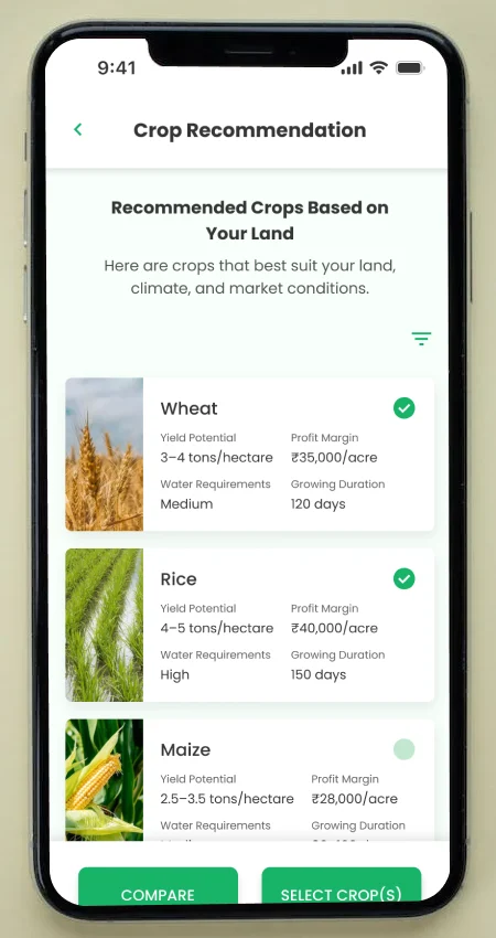
The screens I tested. The final design keeps the features and rebuilds the UX and UI around what the testing showed.

  • Screen: Daily snapshot

    Daily snapshot

  • Screen: AI crop planning

    AI crop planning

  • Screen: Task checklist

    Task checklist

  • Screen: Weather alerts

    Weather alerts

  • Screen: Pest and disease

    Pest and disease

  • Screen: FarmBuddy

    FarmBuddy

  • Screen: Price forecast

    Price forecast

  • Screen: Direct buyers

    Direct buyers

  • Screen: Scheme explorer

    Scheme explorer

19

What it taught me

The biggest lesson was not about farming. It was about which assumptions to test first, and what to design for before you test.

  1. 01

    Language is the first screen

    I tested in English with people who mostly do not read it. The result was predictable, and it is the first thing the final design fixes.

  2. 02

    Direction beats information

    The strongest reaction was to “what should I do today?”, not to any dashboard. Clarity of action is worth more than volume of data.

  3. 03

    Test the riskiest thing early

    Voice came from the farmers, and it was the one thing my prototype could not test. In the final design I plan for it from the start.